Website Part 2: Designing Our Customer Dashboard and Complete User Experience Process
Time to get to the real BUILDING part of this project!
Let’s talk about the process of building the Wandering Aimfully members-only customer dashboard. We knew this part of the process was going to take up the bulk of our time, so when we solidified the basic branding, we immediately started tackling the design of the dashboard.
I started the designs back on March 20th, right after we recorded our product meeting, as I wanted to have our conversation about the overall customer experience still fresh in my mind. Before I get ahead of myself, let me briefly refresh your memory on what the customer dashboard is...
Our main product with Wandering Aimfully will be a monthly membership for $100. With that membership, a customer will get access to:
- All our products and courses (Better Branding Course, Imperfect Writer, EasyCourse, etc.);
- All our software products (Teachery, YourPack, Spruce Metrics, Bumpsale, etc.);
- A private and unbelievably awesome Slack community that is already over 450 members (brought over from BuyOurFuture);
- Ongoing members-only workshops and live calls;
- And a deeper level of access behind the scenes of our business.
Now, the goal of the customer dashboard is to help members sift through all that goodness and consume the resources relevant to them in a meaningful way, bringing maximum value to their lives and businesses.
The two big problems we’re trying to solve with the customer dashboard
In our product meeting post, you learned about how we want to treat our membership like a software product. We not only do we want it to be a library of helpful resources and a vibrant community, but we actually want it to make our customers’ lives better. Our goal is to create something that they actually look forward to paying $100 every month for.
But that means we need to solve two major problems first. These are problems we’ve seen with other membership products, but they’re also problems we’ve been made aware of first-hand by getting feedback on our BuyOurFuture product the past few years.
Problem #1: Oodles and oodles of content
We know that one huge benefit of the Wandering Aimfully membership is the vast library of resources you get access to. As I mentioned before, this means 15 video courses, 10+ video workshops, 5+ e-guides, 100’s of articles (over 400!), 5+ software tools… the list goes on. And with our plans to add more content over time, we knew this library was only going to get more robust.
The downside of this is that if you just throw someone in front of all that stuff, it’s overwhelming. Members would struggle with knowing where to begin. We want to create a dashboard experience that makes sense of all this content and clearly organizes it so you can find what you need, when you need it.
Problem #2: Broadness of content
Another benefit of our membership is that it isn’t just limited to very niche business topics. Yes, we have resources on business basics, online course creation, sponsorship, branding, and making money, BUT we also have resources on tapping into your intuition, getting out of debt, hand-lettering with an iPad, minimalism, prioritizing life, etc.
We believe this mixture of life, business, and creativity resources is a huge differentiator that will help us stand out from memberships that are exclusively business-related, BUT the downside is that not all resources apply to every person. Some people will want to sign up for the membership because they want to learn a specific skill (ie. branding) but others may want a big lifestyle shift (ie. paying off debt.)
Our dashboard experience needed to provide a way for a member to customize their experience and easily access whatever content topics were most relevant to them during a given time.


The Solution
Knowing that these two problems were what we needed to solve for, we knew the dashboard design should focus on two key features: search & customization.
The design process begins with ideas
With this focus in mind, it was time to brainstorm. Jason and I sat down and let our brains run wild with what the dashboard experience could be like.
When it comes to brainstorming, it all begins with these two miraculous words: What if?
For half an hour, we sat down and jammed on all our what ifs:
- What if you could search through every different type of content we have and clearly see each one sorted by course, tool, article etc.
- What if you could not only search by keyword or topic but also specific goals that we offer people like “how to start a podcast”
- What if every member could save the relevant pieces of content to them on their own custom “dashboard”
- What if everyone could specify and edit a singular goal to remind themselves of what they’re working toward
- What if members could easily find each other to collaborate and post “job openings” when they want to hire another member for work
- What if we created mini tools/apps that would help members with one specific skill like setting up a launch calendar or building a sales page
- What if we outlined roadmaps which were clear lists of to-dos to execute on a few key goals and we allowed members to check off their to-dos within their dashboard?
- What if you got fun badges for every course you completed or goal you hit?
- What if you were able to add notes to every course or article to keep all your thoughts in one place as you were learning new things?
We knew good and well that we wouldn’t be able to execute on all of these features, but Jason’s mentality was… let’s shoot for the moon and then scale it back if we need to.
We decided we would design for these features and then adapt them depending on the feasibility of turning them into reality according to our developer (much like building a software application, which Jason has some experience with).
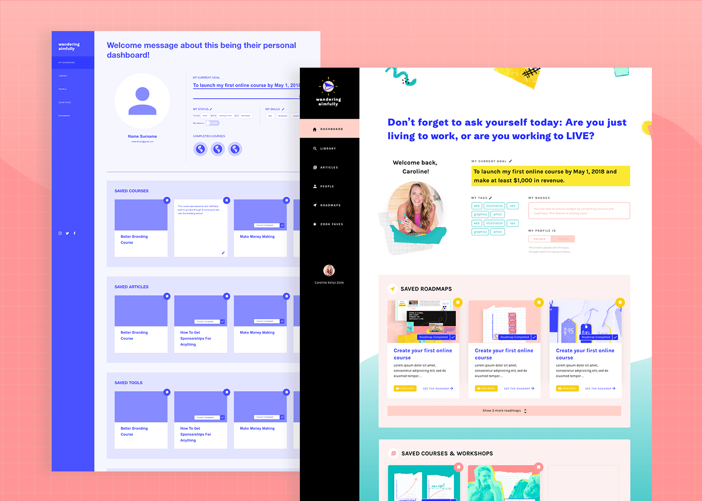
Core functionality: the library and the dashboard
Looking at our list of brainstorm ideas against our two big problems we were trying to solve, a basic structure of the dashboard came into focus. The key components would be a library of every piece of content within Wandering Aimfully, easily searchable by keyword, AND a customizable user dashboard allowing a user to save content relevant to their needs at the time.
Now, how do we display hundreds of pieces of content in a way that is visually appealing and easy to digest? Both Jason and I imagined every resource within Wandering Aimfully as a different type of content “card” (which is basically a way of displaying a link to that content with an image, description, and link). These cards would be color-coded and displayed by these six categories:
- Roadmaps - these would be start to finish checklists to reach popular goals within the community (like “start a podcast” - more on this below)
- Courses & Workshops - links to our 15 courses and recorded video workshops
- Tools & Software - links to our 5 software products and any mini tools/apps we create in the future
- Articles & Guides - links to all our blog posts and downloadable full-length guides. (Yes, we know the blog posts are technically viewable to non-members, but this will allow members to search them easily alongside other content types and save them for later.)
- People - links to other member profiles
- Faves - links to recommendations from us like books, podcasts, products, etc.

Here's an example of what the six types of content cards will look like in the dashboard (ignore the mis-matched thumbnail images!)
Now, let’s say you’re a member who wants to find all the content within Wandering Aimfully about podcasts, for example. Rather than trying to scroll through our entire library of content cards, you can search by the keyword “podcast” and your search would return:
- Roadmaps - Our “Start a podcast” roadmap checklist
- Courses - Podcast Like A Boss and How To Get Sponsorships for Podcasts courses
- Tools - ofCourseBooks, a tool you can use as an intake form for podcast guests
- Articles - Every article on our site related to podcasting
- People - Any fellow members that have identified themselves as podcasters
- Faves - Any products related to podcasting (like Jason’s favorite recording mic, or Caroline’s new favorite podcast)
This search functionality alone we feel is highly valuable. However, it gets better!
Remember, we want a member to build their own custom experience based on their goals. Once you’ve searched through our cards, you also have the ability to save any card to your member dashboard, which is easily accessible from your home screen!

Imagine identifying a goal of launching your first podcast and being able to save this vast number of resources to your own dashboard which you can access anytime. Through Wandering Aimfully, you’re essentially creating your own custom learning experience, PLUS you have the built in accountability and support of an awesome network of friends and you have Jason and myself who have your back.
This is our idea of a great user experience for our customers. Still...
Ideas are great and all, but they’re nothing but fiction until you bring them to life.
Time to get to work!
Our process for designing the customer dashboard
So… where does one even start with designing that experience I described above?
Well, to be perfectly honest, I wasn’t really sure. I’ve designed basic websites before but never something with this kind of functionality and certainly not a software product.
But, we couldn’t really afford to hire a designer AND a developer so… I was basically our best shot. I was going to have to figure it out.
Okay, I’m not a professional UX (user experience) designer. Technically. But that doesn’t mean I can’t learn some best practices and approach this project with confidence and enthusiasm.
Rather than thinking to myself “I’m way out of my depth here,” I decided to look at each stage in this process as a challenge to learn something new or expand my own skillset. Heck, that’s half the fun of it.
So... I literally went to Skillshare (my go-to resource for learning quick processes and design programs) and I typed in “user experience design.” I found a class that looked high quality using a program I’d never heard of called Adobe XD. I already had a Creative Cloud account so I took a look through my suite of apps, and sure enough there it was. Adobe XD. I fired that baby up and hit play.

Meet my Skillshare instructor, Daniel!
Oh. My. Goodness.
This program has changed my game completely, and not just for creating wireframes and prototypes, but I’ve been using it for so many other things (like an easy way to mockup our Instagram grid to keep it consistent with our branding. Design nerd alert!)
I put the Skillshare class on about 1.5x speed (aint nobody got time for 1x) and just followed along with his process except my “class project” was the Wandering Aimfully dashboard.
WIREFRAMES
It started with the wireframes. Armed with this idea of the library, the dashboard, and the content cards by category, the wireframing process went surprisingly quickly. Here’s a look at some of those which I created in a simple monochromatic color scheme to avoid worrying about design too much. The wireframing stage is all about usability and layout, so that becomes the priority.


PROTOTYPING WIREFRAMES
As I was creating the wireframes for our various pages, I learned that one especially cool feature of Adobe XD is the ability to create clickable prototypes. I was able to test out certain interactions, which brought the designs to life in a way that my brain couldn’t quite wrap my head around before. This allowed me to go through the pages of the design and ask myself questions from the user’s perspective:
- What happens when a user clicks xyz?
- How would a user add a card to their dashboard?
- What if a user wants to see all cards?
These questions felt a bit overwhelming but I just took note of each one that popped into my head and made sure to design an interaction for that scenario.

CREATING HIGH FIDELITY DESIGNS
Once Jason and I went over the basic wireframes/prototypes and we agreed on everything, it was time to create the actual “high fidelity” designs with our branding applied. (You can compare these pages to the wireframes above! Keep in mind a lot of the text and images are placeholders!)


Note: I decided to do the final designs in Adobe XD, though I’ve since learned that it’s not the most developer-friendly way to deliver design files, so if you are going to use it, double-check with your developer on how they like design files delivered and what their process is.
I will say, this is about the point in the process where I started to panic a little.
I think I was riding high on the wireframes and learning a new program that I was too excited to really let the doubt creep in. But once it came time to finalize things, that’s when I definitely felt the imposter syndrome closing in. There were so many things I felt I didn’t do “right” and it was easy for me to focus on the fact that I was sort of making it all up as I went along.
BUT, the beauty of making things for years now is that I know when those feelings pop up and I can acknowledge them. I walked over to Jason’s desk and said: “Hi, ummmm, I’m having a real self-doubt-y morning. Can you help?” (<---literally what I said.)
That’s when he launched into one of his pep talks and it helped a ton. I also just reminded myself in that moment that who cares if I wasn’t a professional or if it wasn’t perfect. This customer dashboard I was designing was decidedly better than NO customer dashboard, so it was a major improvement. If there were issues with the design or we wanted to change things when we had more time down the road, we could always iterate (again, like a software product). The important part was just moving forward and bringing this to life.
LOOPING IN OUR DEVELOPER(s)
During the wireframe stage, Jason had already looped in our friend Ben (who is a great front-end developer) to manage expectations on the feasibility of what we wanted to do. A lot of the user profile and customization features we wanted weren’t like anything he’d built before. After a few days tinkering around, Jason reached out to another developer who had more experience in these kinds of projects and integrating them with Wordpress, so we felt confident in our team of two developers to bring our vision to life.
Once I had the high fidelity designs, Jason met with the developers to get their feedback, and based on their recommendations there were a few tweaks I made. (For example, we opted NOT to go with our “Netflix” style horizontal scroll for each card section because it would be a bad experience for anyone that didn’t have a trackpad. Instead we opted for a solution that made visible the first three top cards in each section, with an expand feature that would show all cards in that section upon clicking.

Changing our initial horizontal scroll design to a "show more" alternative
Jason will dive in much more to this part of the process on Thursday’s post which is all about actually bringing designs to life and working with developers.
DELIVERING DESIGN FILES
Once I tweaked my designs, I packaged up the design files and sent that over to Ben so he could get to work building the front-end of the dashboard (this is what customers will see.) Meanwhile, Mark started planning the back-end of the dashboard (managing users in Wordpress, how to create content cards as admins, etc.)
PHEW! Like I said… it’s been quite the process. This has definitely been one of the most involved parts of the entire business-building process—as it should be! This dashboard is an integral piece of what customers will be paying for and we want it to be solid.
Even as I type this I’m still finishing up the final files of some of the other pages within the dashboard (like the “Faves” page and “People” page.) And even when I complete those pages, I'm sure we'll have additional changes down the road.
The hard part is done, right?
Believe it or not, the stakes have gotten even higher because now I’m also splitting time between finishing the dashboard designs AND designing the public-facing Wandering Aimfully site. You know, that slightly important part of our business.
Tune in tomorrow to see how the public-facing website design is going. If you know anyone willing to sell me a few more hours in the day, let me know!