Branding Part 2: Creating A Mood Board and Exploring Brand Visuals

Before we dive head first into developing our brand identity (logo, colors, typography), it's important to start with a visual interpretation of your brand tone.
That's where your mood board comes in!
Starting with brand tone words
Tone words are the bridge that help you take something very abstract (all the information in your Brand Canvas) and translate it into something visual (your mood board, and ultimately, your brand identity.)
If you had to distill the various concepts and themes in your business and your Brand Story into just 5 words... what would they be?
The tone words we landed on for Wandering Aimfully were:
funky, modern, bold, vibrant, friendly, and seeking.
You might notice that was six words. Yeah, we cheated. We needed to add that last sixth word, even though we both agreed it wasn't quite the word we were looking for but it was the closest we could come up with—this notion of constantly exploring. Adventurous felt a little too much like backpacking through the mountains, but seeking felt more like careful and deliberate exploration. I knew it might be difficult to translate this feeling into visuals, but I was up for the challenge!
Steps for creating a brand mood board
If you've never created a mood board before, I thought it might be helpful to walk you through each step of my process.
Step 1: Pin all the things!
Quick question: do you have trouble making decisions when it comes to your branding? Do you find that it's hard to just make a decision and move forward? Don't worry, you're not alone!
In my Better Branding Course, I use a mental tool to help people who have trouble making decisions continue to move forward through the process. I call it the Three Nets.
Imagine you have a big net, medium net, and a small net. You don't have to pick the perfect 10 images right off the bat. Instead, let yourself begin with your BIG net to collect a bunch of different stuff to choose from. That's when I set up a Pinterest board and pin ALL THE THINGS. I pin anything that jumps out at me and speaks to at least one of my tone words. Check out our Pinterest board below for an example of few things we pinned during this phase.
(I made sure to enlist Jason to jump in and pin some things too, even though he doesn't love this part of the process. It's SUPER important if you're collaborating with someone that you're on the same page visually!)
Building Your Visual Vocabulary
If you are someone that doesn't know where to start with pinning or doesn't know how to tie your tone words to images, one thing I recommend is to brush up on what I call your "visual vocabulary."
Your visual vocabulary refers to your ability to communicate certain emotions and feelings with visual elements.
It’s the mental library you keep of connections between visuals and tones, and what they are able to convey.
For example, take a look at these four images below and try to match each one with the corresponding tone word: edgy, romantic, nautical or chic.

Now for the answers…. Did you guess: #1 = nautical; #2 = chic; #3 = romantic; #4 = edgy?
Hopefully you picked up on the fact that:
- the red, white and blue color scheme + the stripes and simplicity of Image #1 made it feel nautical.
- the black and white, serif/italic typography and thin sophistication of the letter strokes made Image #2 feel chic.
- the pink florals and hand-written script of Image #3 made it feel romantic.
- And lastly, the neon color, grungy texture and bold of Image #4 made it come across as edgy.
See how certain design elements can contribute to one overall tone of an image? To develop your visual vocabulary, next time you see an image (an ad in a magazine, a post on Instagram, etc.) that makes you feel something immediately or that makes one word instantly come to mind (happy, positive, moody, fresh, rustic, etc.), try and pick out what specific elements of that photo or design you’re associating with that word. This will help you build that mental library of things to look out for when you're matching visuals to your brand tone.
Step 2: Look for themes and narrow down your collection to similar feeling images.
This is when that medium net comes in! Look for any threads among your pins and start to remove ones that stand out like a sore thumb.
I find it really helpful to create what I call a “tone spectrum.” This is where I set up an Adobe Illustrator board with my tone words and I start adding images on the spectrum underneath the tone word that they best represent. Sometimes an image will land between two words, so I’ll put them right there in between them.
This helps me map my images to my tone words to make sure all my tone words are well represented. Any images that don’t seem to fit the overall trend, I take out.
For example… below you can see in my tone spectrum, there was an image that felt funky and vibrant in our Pinterest collection, but it felt way too dark and mysterious compared to the overall feeling I had going on with my tone spectrum, so I took it out.

My brand tone spectrum helps me distribute images across my tone words and look for any that don't trend with the rest which helps me narrow things down
Step 3: Narrow down your images further and create your mood board.
Create a mood board using a mixture of images from your tone spectrum. I used to create my mood boards using a very organized, grid layout. These days, however, I prefer a more organic and suggestive look, so I use Adobe Illustrator to layer them like you might a bulletin board in real life.

Woohoo! Now you celebrate!
Use the vibe of your mood board to explore fonts, colors and graphic elements
Now it's time to play!
Trying to take an assortment of images like a mood board and suddenly translate it into a brand identity can feel really overwhelming and daunting. That’s why I build in “exploration” phase where I allow myself to explore and experiment with any elements that stand out to me in my mood board. It's like a visual brainstorm or a warm-up!
The first thing I do is pull out any colors that stand out to me from my mood board. (Usually without realizing it, I find that a few colors will be repeated in my board.) I open up an Adobe Illustrator file and start with swatches at the top of my board. These will most likely be narrowed down and tweaked to get them just right, but this way I know my resulting color palette comes from my mood board.
I also pull out any fonts I see in my mood board that are worth exploring. The bolder one below was from an image I pinned, and then I knew I wanted a monotype font as an accent (seen in the tone words below) because it reminded me of both something modern AND something you might use on like a label maker or scrapbook with a very "found object" collection feel, which plays into that wandering feeling from my Brand Story.

I also take a second to double check the visual direction I’m going in with my brand canvas. Does it align with all the Brand Story work we did? Does the visual direction echo our values, our story, and our business foundation?
In this case, I love how the color palette feels vibrant and energetic, but it doesn't drift too pastel-y with the addition of the royal blue, green and gray/black touches.
I also like that it has a balance between masculine and feminine energies. The warm tones and pinks in the palette feel more traditionally feminine and soft, while the blue, bright mint and black feel more masculine and funky. This reflects the blend of Jason’s brand and my brand… as well as the balance of the many dualities represented in Wandering Aimfully as a business.
This will all be tightened up later on, but again for now it's just important that I have some jumping off points. That will help me navigate the branding process without getting overwhelmed.
Finally, I look for any visual elements that I can pluck right out of my mood board and play around with in my explorations. Here are some I wrote down:
- Collage/layers
- Hand-drawn type
- Torn paper
- Combining drawn elements with photos
- Duotone photo treatment
Taking brand elements for a test drive
Everyone will probably have a unique process, but for me to understand if brand elements are working well together, I need to see them applied to actual environments where they might be used. That's why I usually use web design and blog post layouts in my brand explorations, as well as blog graphics or social media images. These are the primary uses for an online brand, so why not see if the brand elements work from the get go?
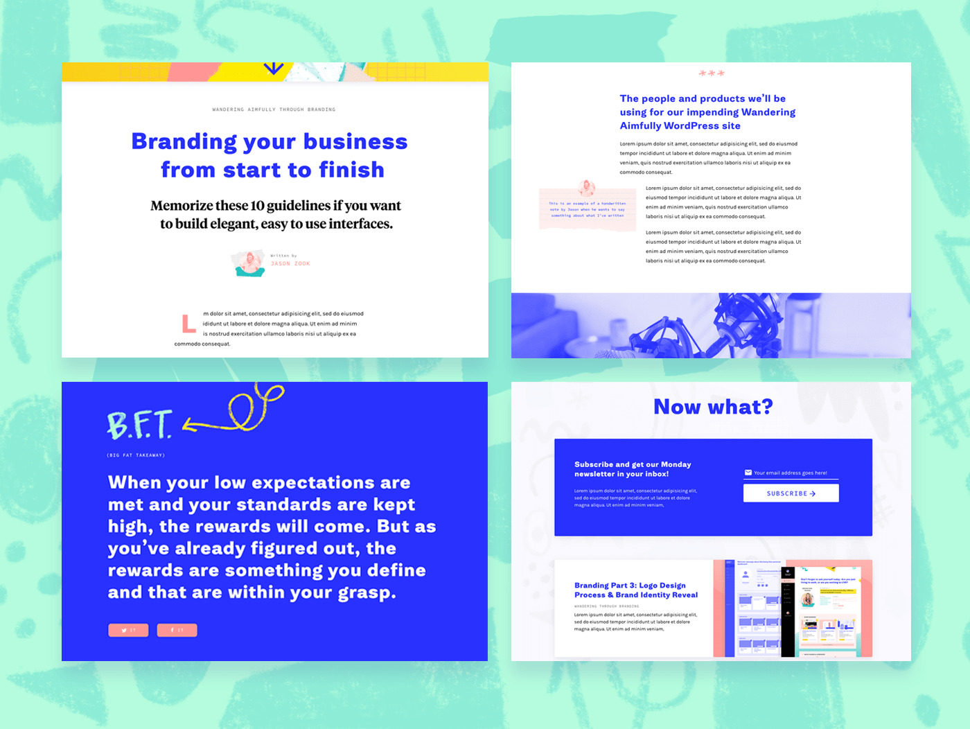
Here are a few screenshots from my Illustrator board. Again, this is not for the actual purpose of creating a website, it's just to see how potential fonts, colors, and graphic elements could be used in combination in those environments.

Okay... that's all you get to see!
That's is for the mood board and brand exploration process. Check out the next post for Part Three, the final step of our branding journey. I'll share more info on how and why I decided on the final color palette, typography palette, and... gasp... the logo!
A final word on branding your business
This is the last thing I'll say about branding, but I think it's important that I mention it. You're ALWAYS going to have moments of self-doubt. Moments where you wonder... am I going in the right direction? Will my audience like it? Is it [insert word you want it to be] enough?
But the thing I encourage you to remember is that done is better than perfect. Don't use branding as a place to hide from actually putting your idea into the world. Don't spend three weeks convincing yourself it's necessary to get the perfect shade of green, when really that's three weeks that could've brought you closer to launching your business and getting customers.
In our case, I literally had two days to come up with the branding to keep us on track. That's UNHEARD of in my book. But you know what? It was freeing. It forced me to go with my instincts and not obsess over the what-ifs.
So trust your gut. Make decisions. And remember that nothing is permanent. Then blaze forward! You got this.